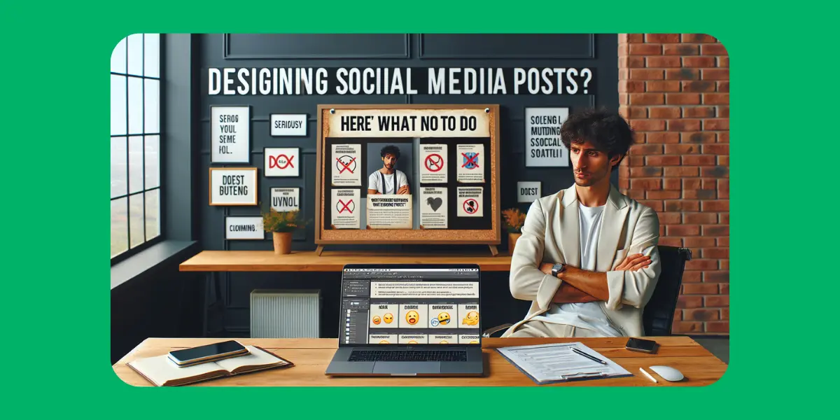
Designing Social Media Posts? Here’s What Not to Do (Seriously)
Social media is a jungle, and your posts need to stand out like a flamingo in a flock of pigeons. But some design mistakes can make your content blend in with the noise — or worse, get a big fat “meh” from your audience.
Here’s your crash course on what NOT to do when designing social media posts. Trust us, your followers will thank you.
🚫 Don’t Use 17 Different Fonts
Yes, we said it. Mixing fonts can make your post look like a ransom note. Stick to 2-3 max — one for headlines, one for body text, and maybe a fun one for accents.
🚫 Avoid Tiny Text (Unless You Want People to Squint)
If your audience can’t read your message without a magnifying glass, you’ve lost them. Make sure your text is big enough to be read on a phone screen — because that’s where most eyeballs are.
🚫 Don’t Overload With Info
Less is more. Don’t cram every detail into one post. Keep your message clear and focused — save the novel for your blog.
🚫 Skip Clashing Colors
Neon pink text on a bright yellow background? Your eyes will hurt just reading that. Use color combos that complement or contrast well — and keep accessibility in mind.
🚫 Say No to Low-Quality Images
Pixelated, blurry, or stretched images scream unprofessional. Always use high-quality photos — and if you need to remove backgrounds for a cleaner look, you know where to go: bgremover.io
🚫 Avoid Ignoring Your Brand Style
Your posts should look like you. Stick to your brand’s colors, fonts, and vibe to build recognition and trust over time.
🚫 Don’t Forget a Clear Call-to-Action (CTA)
What do you want people to do? Like, comment, share, or click? Make it obvious with buttons, arrows, or simple text prompts.
🚫 Don’t Rely on Stock Photos That Look Fake
Authenticity wins. Choose stock images that feel real and relatable. Bonus points if you can add your personal touch or customize the background with bgremover.io.
Final Thought:
Designing social media posts isn’t rocket science, but avoiding these common traps will make a huge difference in engagement and reach. Keep it simple, clear, and on-brand — and watch your content shine.