Fonts Matter More Than You Think: How Typography Shapes Your Image
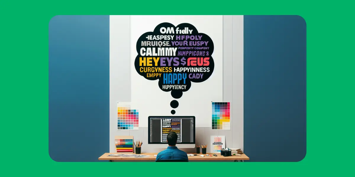
When it comes to visual content, most people focus on colors, layout, or imagery. But there’s one subtle element that influences everything—from perception to conversion—and that’s typography. The fonts you choose aren't just about aesthetics. They shape your message, define your tone, and directly impact how your audience feels about your brand.
Let’s explore why fonts are far more powerful than you think.
First Impressions Start with Letters
Fonts are the visual voice of your content. A sleek modern sans-serif like Helvetica screams minimalism and innovation. A serif font like Times New Roman adds an air of tradition and authority. A playful handwritten typeface brings out personality and friendliness.
In just a few seconds, your typography sends a message—even before the words are read.
Fonts Influence Readability and Engagement
Even the best content can fall flat if it’s hard to read. If users are squinting or zooming in, they’re gone.
Good typography ensures:
Clear readability on all devices
Proper spacing (line-height and letter spacing)
Smooth eye flow through the page
When people enjoy reading, they stay longer, scroll further, and engage more.
Typography Sets the Tone
Imagine reading legal advice in Comic Sans or a luxury perfume ad in Courier New. Awkward, right?
Fonts align with your brand’s tone and emotion. Are you:
Formal or casual?
Modern or vintage?
Bold or refined?
Your typography should match the personality you want your audience to feel.
Consistency Builds Brand Trust
Using the same font styles across your website, ads, and social media builds visual identity. Inconsistent typography makes your content look chaotic and unprofessional.
Great brands are known not just by their logos—but also their signature fonts. Think Coca-Cola, Vogue, or Google.
Font Size and Hierarchy Guide Attention
Typography helps direct where users look first. Use size, weight, and spacing strategically:
Headlines grab attention
Subheadings provide structure
Body text tells the story
A strong visual hierarchy keeps users scrolling and improves information retention.
Font Performance Matters Too
Choosing fancy custom fonts may look great—but they can slow down your site. Use web-safe or properly optimized fonts to ensure fast load times without sacrificing style. Google Fonts is a great resource for high-performance typography.
Final Thoughts
Fonts aren’t just decorations. They’re design tools with real influence over how your content is perceived and received.
So the next time you create a post, design an ad, or launch a website—don’t just pick a font that “looks nice.” Choose one that communicates your message, supports your brand, and connects with your audience.