Color Me Right: How Color Accuracy Impacts Your Visual Content
Ever seen a product online that looked fire-red but arrived looking like... tomato soup? Yeah, that’s what happens when color accuracy goes rogue.
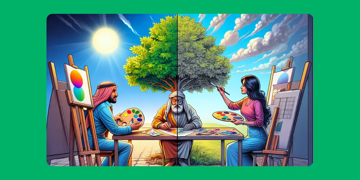
Color isn’t just a pretty feature in your visuals—it’s the secret sauce behind trust, professionalism, and that “OMG I want this!” reaction. Whether you’re a designer, brand, or meme lord, getting your colors right matters more than you think.
Why Should You Care About Color Accuracy?
Because your content’s vibe depends on it. That dreamy lavender background or that perfect coffee-brown logo can turn into a disaster if your colors shift between devices. If your Instagram post screams sunshine yellow on your laptop but looks like mustard fog on a phone, you’ve lost half your aesthetic points.
The Big Culprits Behind Color Inaccuracy
Different Screens, Different Worlds
Not all screens are created equal. Your image might look sharp and vibrant on your iPhone but dull and gray on your coworker’s dusty monitor from 2008.Wrong File Formats
Saving your art in the wrong format (lookin’ at you, low-quality JPG) can mess up your shades big time.No Color Profile? Big Problem
Devices use color profiles (like sRGB or Adobe RGB) to read color info. Skip setting one, and your hot pink might turn salmon.
How to Get Colors That Actually Stay True
Use the Right File Formats: PNG and TIFF are champs at preserving color integrity.
Always Work in sRGB: It’s the most universally recognized color space on the internet.
Calibrate Your Screen: No joke. A quick calibration tool can show you what your monitor's been hiding.
Avoid Overediting: Cranking up saturation or filters can make your image look fake (unless that’s the vibe you're going for).
Bonus: Color Builds Trust (No Really)
Studies show people decide how they feel about a product in 90 seconds—and 90% of that decision is based on color. So, yes, your sky blue vs. teal dilemma is totally valid.
Final Thought:
Colors speak louder than words sometimes. Getting them wrong can make your visuals forgettable—or worse, totally misleading. But get them right? Chef’s kiss. Your visuals pop, your brand feels pro, and your audience stays hooked.
Now go forth and color responsibly.